As equities remain on cruise control and there’s really not much new to report on the daily front I decided to take a peek at some of my longer term momentum charts. The ones that stood out all relate to market breadth, which refers to the ratio between advancing stocks vs. declining stocks. But why would we care about that?
The breadth of market theory is a technical analysis methodology that predicts the strength of the market according to the number of stocks that advance or decline in a particular session, or how much upside volume there is relative to downside volume.
We’ve had upside volume galore especially given that we’re still at the tail end of the summer season. But over the past few weeks I’ve been rather prolific about the fact that big tech is increasingly and heavily dominating equities. Everything else simply pales in comparison.
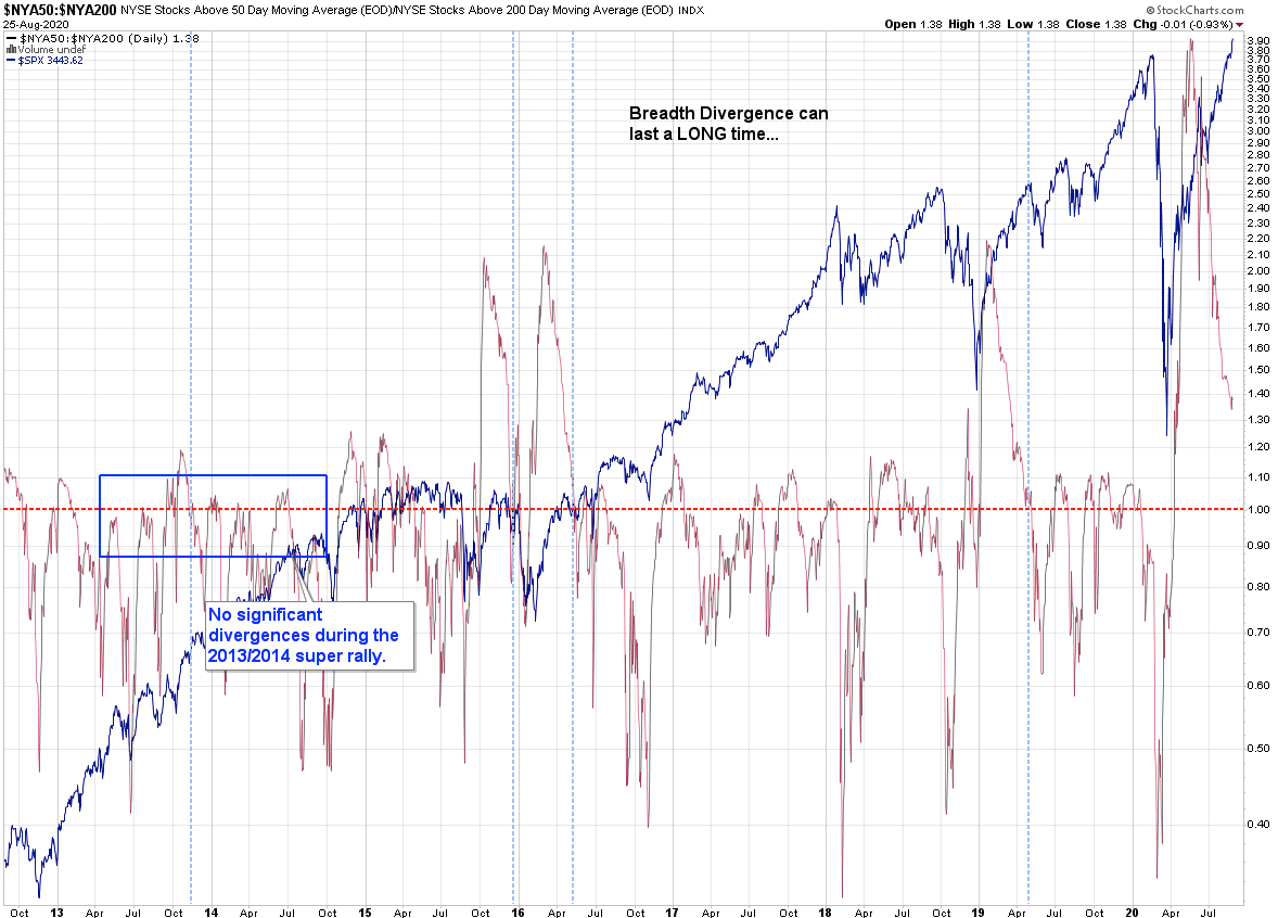
Looking at the chart above you see the SPX plotted behind NYSE market breadth. I’ve mentioned on many occasions that extreme signals can maintain much longer than you can remain solvent.
Per the situation in the here and now, as you can see we’ve got a long long way to go until we’re even getting close to the 1.0 mark. So if you’re feeling bearish you may want to hold your horses.
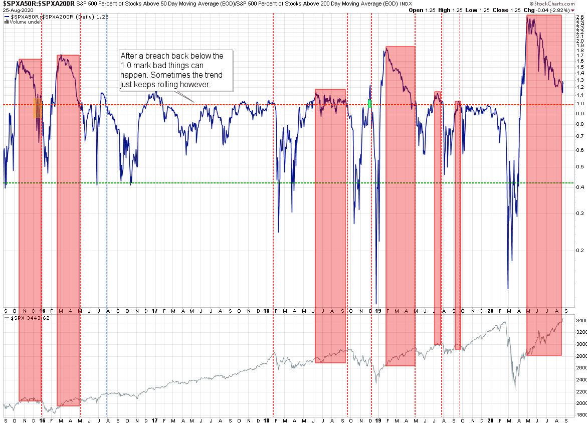
Here’s a similar market breadth chart but against the S&P 500 cash, a.k.a. the SPX. I think the vertical lines I drew tell the story and require little explanation. This has been a pretty reliable long term indicator and extremely helpful when it comes to putting the overall trend into context.
Please log in to your RPQ membership in order to view the rest of this post. Not a member yet? Click here to learn more about how Red Pill Quants can help you advance your trading to the next level.