This is going to be a quick drive by post as I have my second crypto trading masterclass scheduled for tonight at 4:00pm Eastern. Be there or be square! Anyway, yesterday’s drop in equities at first look like the real McCoy but then – true to form – yet another floor materialized late in the session.
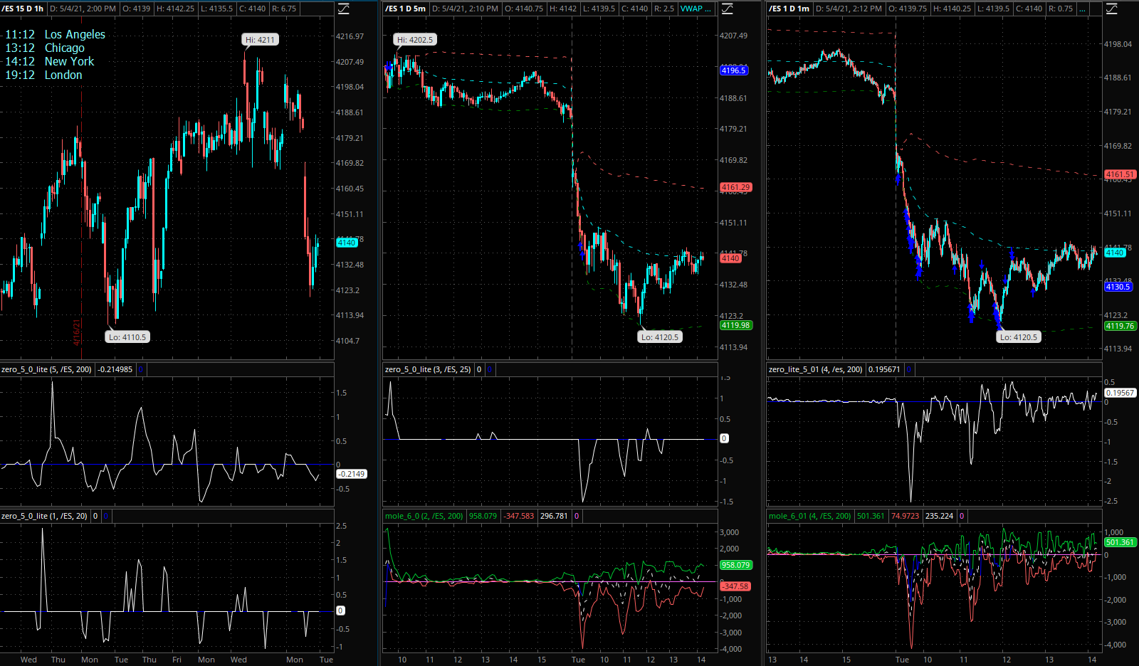
This was the snapshot I posted in the comment section around that time. Clearly a bullish divergence had formed on the Zero indicator, which strongly suggested that a floor was being painted.
Years of looking at the Zero signals have taught me to always wait for price confirmation, which can come in the form of a spike high breach (already in place at that time) and preferably a climb back above VWAP.
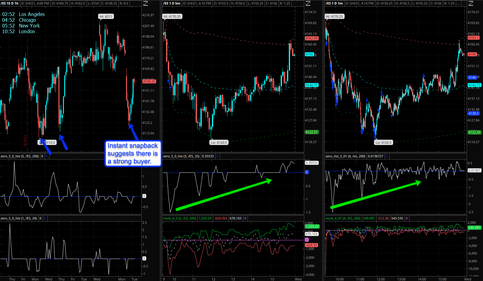
Which is exactly what we got served in the end of course. As some of you may recall on Monday morning I had placed a boatload of butterflies right around the SPY 411 mark. Which briefly started to look like the golden ticket but not for long.
The odds of success at this point have dropped significantly mainly because it appears that there is a strong buyer holding the SPX 4120 mark. This is also clearly shown by the expected move range that continues to propagate sideways.
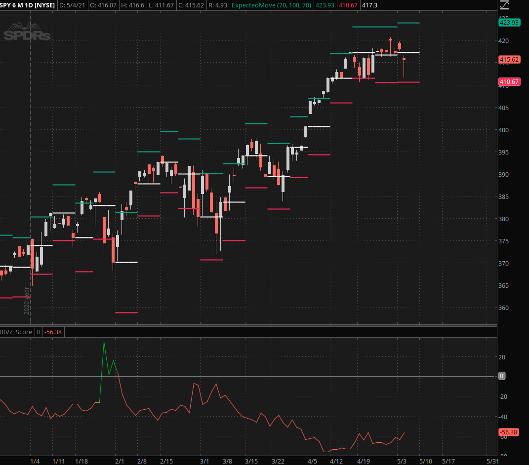
Make no mistake, there’s a TON of gamma risk that is accumulating around both thresholds (i.e. SPY 411 and SPY 423) which I expect will resolve sometime before the end of this week.
The question for many tired with the Fed’s eternal put of course is: will it resolve to the downside?
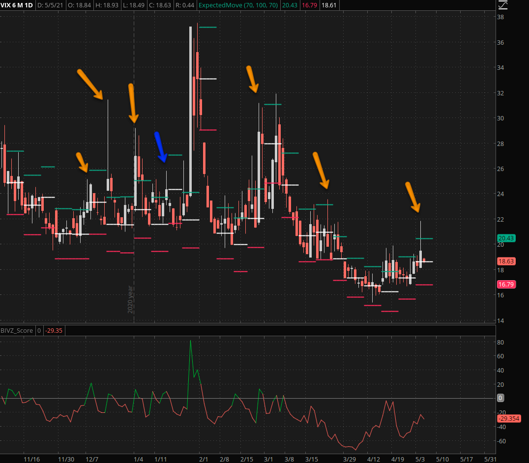
And the answer for that is – well, it’s doubtful at least judging by prior precedent. If you compare the recent quick spikes on the VIX, the tail heavy shooting stars if you will, they usually reverted lower.
Which makes sense as attempts to take down equities by a notch or two continue to be thwarted by a big buyer (meaning institutional buying) that stands ready to paint a permanent floor which continues to get ratcheted higher over time.
But Wait There Is More
The other observation I like you to pay attention to is a bit more subtle but it provides important clues as to where we stand in regards to the current bull market.
By accident I had left the expected move indicator on the chart which I usually don’t do as you just can’t use expected move with the VIX for trading. However, that said, sometimes serendipitous mistakes can lead to surprising insights.
If you look at the VIX expected move range you can see that the VIX has mainly remained in the upper half of its weekly auto-expected move ranges. How is that meaningful? It is in some respect, if you pay closer attention to what happened when it actually managed to breach < the center and close in the lower half.
What appears to happen afterward is continuation lower – meaning a push to the upside in equities – while more time spent in the upper half appears to lead to more moves to the upside in equities.
This is an observation I will devote a bit of time to in the near future, because if I can quantify this as a real edge it would be manna from heaven in regard to trading options.
See you later today!
P.S.: I guess the post ran longer than I thought…